

Exploring ConstraintLayout in Android
Now a day ConstraintLayout is more popular to use in Android XML to build Android design better. I have seen many of my friends they are using the ConstraintLayout in XML for layout design. So in this tutorial, we will learn what is ConstraintLayout? Why is better from other layout and how to use better layout design by using Constraint Layout?
ConstraintLayout: By the Official documentation ConstraintLayout is a ViewGroup which allows you to position and size widgets in a flexible way. ConstraintLayout available as a support library that you can use on Android systems starting with API level 9 (Gingerbread).
This new layout is a flexible layout manager for your app that allows you to create dynamic user interfaces without nesting multiple layouts. It is distributed as a support library that is tightly coupled with Android Studio and backward compatible to API Level 9.
At first glance, Constraint Layout is similar to RelativeLayout. However, the Constraint Layout was designed to be used in Studio and it can efficiently express your app design so that you rely on fewer layouts like LinearLayout, FrameLayout, TableLayout, or GridLayout. Lastly, with the built-in automatic constraints inference engine. You can freely design your UI to your liking and let Android Studio do the hard work.
Why ConstraintLayout: In the words of Xaver Kapeller, The main purpose of the ConstraintLayout is to fix problems with the RelativeLayout, and it does it so well. You can do so many things that were impossible with a RelativeLayout. And you can simplify your layout like you never could before. Additionally if fixes a long standing performance issues of the RelativeLayout. The double taxation during the measure/layout phase. So we get better performance, more versatility and much simpler layouts in one nice package.
If I explain in short then I would say the main aim of implementing the ConstraintLayout is two reason.
- To make handling complex screen designs easier
- To improve the performance of complex layouts
As users we all want the apps on our devices to run as smoothly as possible. And as developers, we want to deliver this experience to our users. When it comes to performance improvements there is never any limit for additional improvements. So if Google helps us, I’m more than happy. Maybe this way the ConstraintLayout also reduces the need for some custom views or layouts.
Ok Great 🙂
How can we use ConstraintLayout: ConstraintLayout is also an unbundled library and that’s important both for you as developers and for us as the creator of the library. Very first thing in new android studio 2.3.3 it is inbuilt now. You don’t need to add any dependency.
While creating any new Android project it will come with added in Gradle dependency. An alternative if you are using lower version android studio then you need to add manually in your app Gradle file.
compile 'com.android.support.constraint:constraint-layout:1.0.2'
Let’s create one basic layout design to use this ConstraintLayout attributes to better understand. I want to create layout XML of below design which I already took a snap to represented.

XML looks this.
<?xml version="1.0" encoding="utf-8"?>
<android.support.constraint.ConstraintLayout xmlns:android="http://schemas.android.com/apk/res/android"
    xmlns:app="http://schemas.android.com/apk/res-auto"
    xmlns:tools="http://schemas.android.com/tools"
    android:layout_width="match_parent"
    android:layout_height="match_parent"
    tools:context="com.sunil.androidconstraintlayout.MainActivity">

   <ImageView
       android:id="@+id/ImageView"
       android:src="@mipmap/ic_launcher_round"
       android:layout_width="120dp"
       android:layout_height="120dp"
       app:layout_constraintLeft_toLeftOf="parent"
       app:layout_constraintTop_toTopOf="parent" />

    <TextView
        android:layout_width="0dp"
        android:layout_height="wrap_content"
        android:text="This is Title"
        android:textSize="20sp"
        android:padding="5dp"
        android:id="@+id/textview_title"
        app:layout_constraintLeft_toRightOf="@+id/ImageView"
        app:layout_constraintRight_toRightOf="parent"
        app:layout_constraintTop_toTopOf="parent" />

    <TextView
        app:layout_constraintLeft_toRightOf="@+id/ImageView"
        app:layout_constraintRight_toRightOf="parent"
        app:layout_constraintTop_toBottomOf="@+id/textview_title"
        android:layout_width="0dp"
        android:layout_height="80dp"
        android:padding="5dp"
        android:textSize="15sp"
        android:id="@+id/descriptionTextView"
        android:text="This is description Which describe in detail about the title. Do you want to exlare it to get the detail?"/>

    <Button
        app:layout_constraintLeft_toLeftOf="@+id/descriptionTextView"
        app:layout_constraintTop_toBottomOf="@+id/ImageView"
        android:text="Explore me"
        android:background="@color/colorPrimary"
        android:textColor="#ffff"
        android:layout_margin="5dp"
        android:layout_width="250dp"
        android:layout_height="48dp" />

</android.support.constraint.ConstraintLayout>
Here I used to some of the attributes of ConstaintLayout. Let me explained all basic tag.
- constraintTop_toTopOf — Align the top of the desired view to the top of another.
- constraintTop_toTopOf — Align the top of the desired view to the top of another.
- layout_constraintTop_toBottomOf — Align the top of the desired view to the bottom of another.
- layout_constraintTop_toBottomOf — Align the top of the desired view to the bottom of another.
- layout_constraintBottom_toTopOf — Align the bottom of the desired view to the top of another.
- layout_constraintBottom_toBottomOf — Align the bottom of the desired view to the bottom of another.
- layout_constraintLeft_toTopOf — Align the left of the desired view to the top of another.
- layout_constraintLeft_toBottomOf — Align the left of the desired view to the bottom of another.
- layout_constraintLeft_toLeftOf — Align the left of the desired view to the left of another.
- layout_constraintLeft_toRightOf — Align the left of the desired view to the right of another.
- layout_constraintRight_toTopOf — Align the right of the desired view to the top of another.
- layout_constraintRight_toBottomOf — Align the right of the desired view to the bottom of another.
- layout_constraintRight_toLeftOf — Align the right of the desired view to the left of another.
- layout_constraintRight_toRightOf — Align the right of the desired view to the right of another.
Let’s check android studio design for above layout.

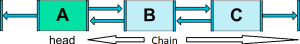
Let’s see some of the new cool concepts called chaining.
Chain Concept: Chains provide group-like behavior in a single axis (horizontally or vertically). The other axis can be constrained independently. When we have Bi Directional relationship between views. The editor automatically takes that as chaining.
Chain Head: Chains are controlled by attributes set on the first element of the chain (the “head” of the chain). The head is the left most widget for horizontal chains and the top-most widget for vertical chains. So the whole chain depends on this head.
Let’s discuss the what are types of the chain?
You just need to add this property attribute:
app:layout_constraintHorizontal_chainStyle="spread"
- Spread Chain: This is the default chain. In this chain, the elements will be spread out.

- Spread_Inside Chain: similar, but the endpoints of the chain will not be spread out.
app:layout_constraintHorizontal_chainStyle="spread_inside"

- Packed chain: The elements of the chain will be packed together. The horizontal or vertical bias attribute of the child will then affect the positioning of the packed elements.
app:layout_constraintHorizontal_chainStyle="packed"

    app:layout_constraintHorizontal_chainStyle="packed"
    app:layout_constraintHorizontal_bias="1"
- Weighted chain: The default behavior of a chain is to spread the elements equally in the available space. The first element using a weight of 2 and the second a weight of 1, the space occupied by the first element will be twice that of the second element.
app:layout_constraintHorizontal_weight="1"

Here is the result that I view on design layout.

Wrapping Up: we’ve taken a quick look at the new ConstraintLayout, it’s capabilities and how we can use it to create more efficient layouts within our applications. The more we use it the more we will know how to do stuff. Please use as much as possible and play work around.
If you wondering Kotlin for android then I would be recommended to check all this post of Kotlin Category.
Please do subscribe your email to get the every newsletter from this blog and if you feel that this post helps you then do not forget to share and comment below.
Reference used is here and here to get more detail.
Keep Happy coding 🙂
I am a very enthusiastic Android developer to build solid Android apps. I have a keen interest in developing for Android and have published apps to the Google Play Store. I always open to learning new technologies. For any help drop us a line anytime at contact@mobologicplus.com


